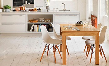
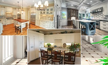
For most people, the kitchen is the center of family life. This is a place where everyone comes in the mornings, starting their day, and where everyone comes together in the evenings for dinner. However, not every family can boast a large kitchen.
However, the fact that you do not have enough space does not mean that you cannot have a wonderful kitchen. Designing a small kitchen is a special art, but using our tips and tricks, you can turn it into a comfortable and functional space, a place where you want to return.
Content:
Color schemes
Find serenity and tranquility in muted blue shades - color
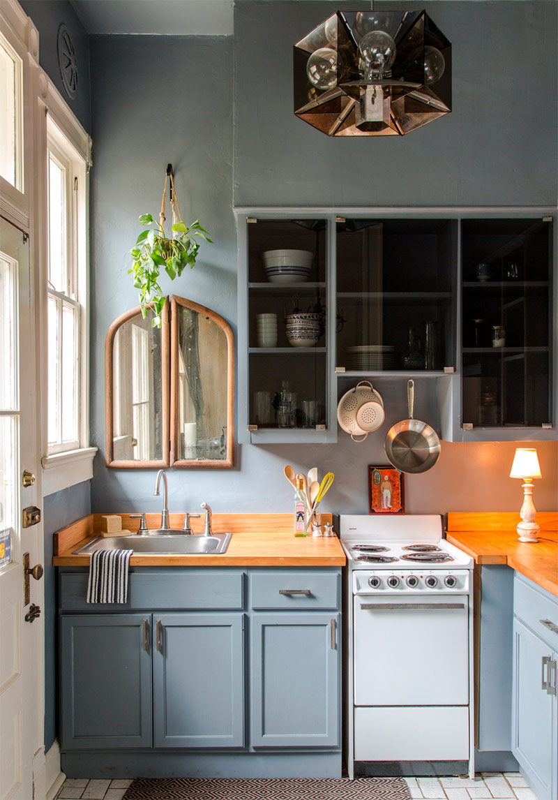
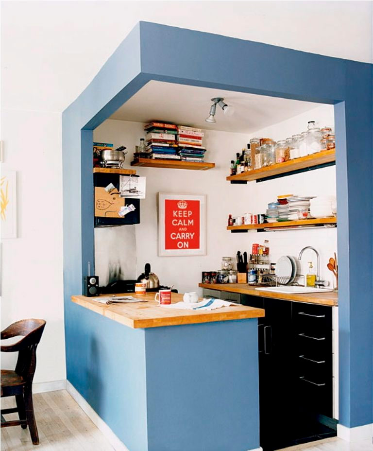
Blue - the color is bright and cheerful. It will look good in any kitchen. However, some find blue too bold and overwhelming. The owner of this modest kitchen created a bright, but at the same time restrained atmosphere with the help of a muted blue tint on the walls and cabinets. An interesting design decision is the mirror above the sink. For most of us, a sink with a mirror is associated with a bathroom, however, in the kitchen, this element is very appropriate. Moreover, in a small kitchen, a mirror can work wonders, visually expanding the space. The transparent top-level cabinet doors also add some extra dimensions to this small but attractive space.
Very narrow space thanks to bright shades gets bigger - color
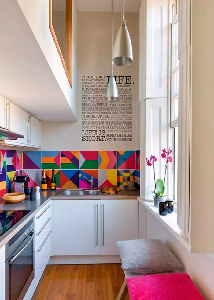
When it comes to decorating a small kitchen, don't feel constrained by old design methods. The layout of this kitchen is very unconventional - a narrow space, but at the same time very high ceilings. So that architectural flaws did not seem such, the owners of the kitchen used a decor located high enough. Decorative wall stickers and cute pendant lights look up, which allows you to focus on the high ceiling, and not on a narrow space. The multi-colored kitchen apron that looks particularly attractive against the background of white cabinets and walls brings a sense of joy to this kitchen.
Classic with a touch of modernity - color
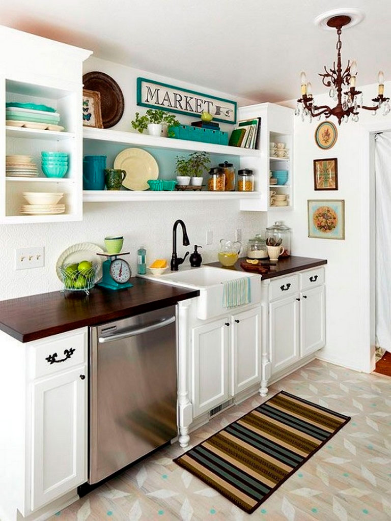
White cabinets and walls can be found in so many kitchens. For some, this may seem boring, but it should be noted that it is quite practical. With this simple framework, you can create almost any decor scheme in your space. For example, in this kitchen, emerald and cream are used as accent colors. An important role in this interior is played by an antique chandelier, which gives the modern kitchen a slight retro charm.
The combination of modern and retro - color
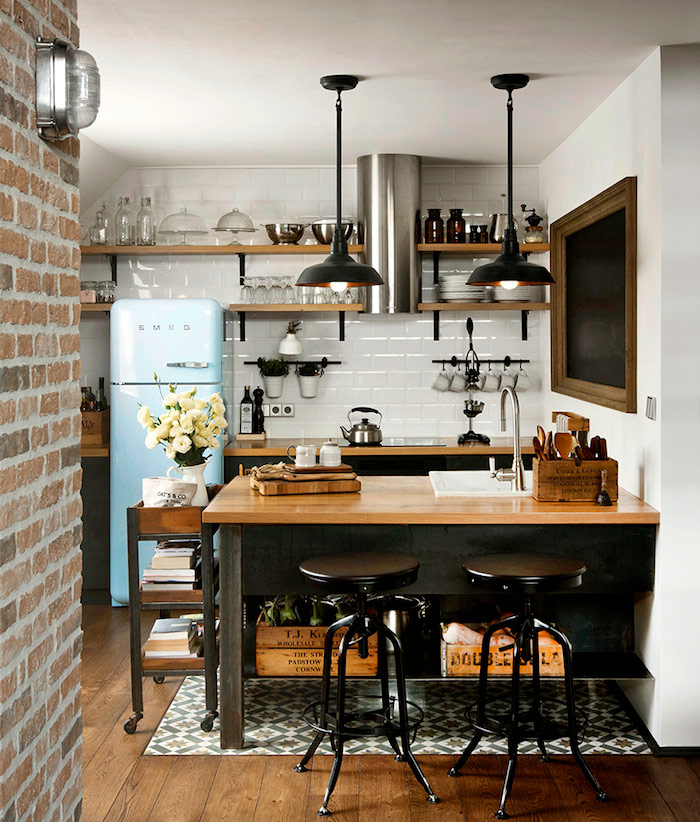
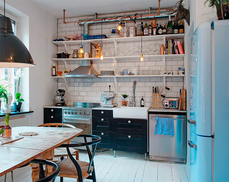
The combination of a light blue retro refrigerator with brilliant black accents in this tiny kitchen is truly inspiring. The bright white tile of the kitchen apron ties the whole picture together. The furnishings of this kitchen serve as a good example of how wonderful an interior can be if you do not limit yourself to design ideas of only one era. The mixture of old and new gives rise to a charming and quite modern look. Small accents such as cream-colored flowers and antique wooden boxes complete this truly magnificent picture.
Black and White Elegance - Color
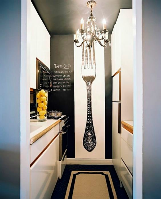
A few words should be said about the elegance of black and white decor.The residents of this apartment got an incredibly narrow kitchen, which does not have high ceilings in order to somehow compensate for this drawback. Instead of redevelopment of the premises, the owners painted the ceiling and one wall black as a blackboard, adding a large picture with an ornate antique fork. A beautiful black chandelier in the French style completes the resulting very elegant look of the interior. This is an example of a kitchen design that could remain incredibly boring and dreary, but was animated with a few simple touches.
Bright yellow color and metal surfaces - color
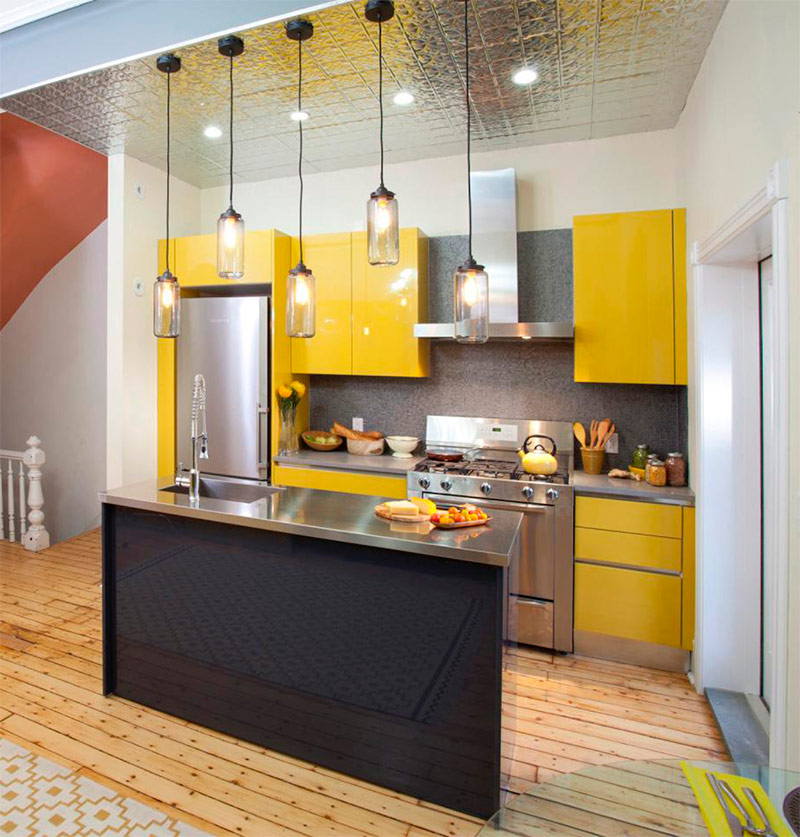
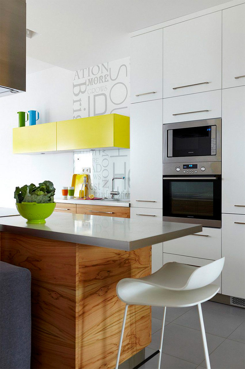
Do not be surprised to see a lot of metal or other reflective surfaces when you get acquainted with other people's examples in search of design ideas for a small kitchen. Materials such as polished tin are great for small spaces. Firstly, they have a matte sheen that is pleasing to the eye. Secondly, and more importantly, they reflect surrounding objects, creating the illusion of an increase in space. That is why designers, trying to push the boundaries of a small room, use a lot of mirrors. The reflective ceiling in this kitchen creates the feeling that the ceilings here are much higher than it actually is. The bright yellow color of the cabinets also makes the space more open.
Classic and rustic cozy - color
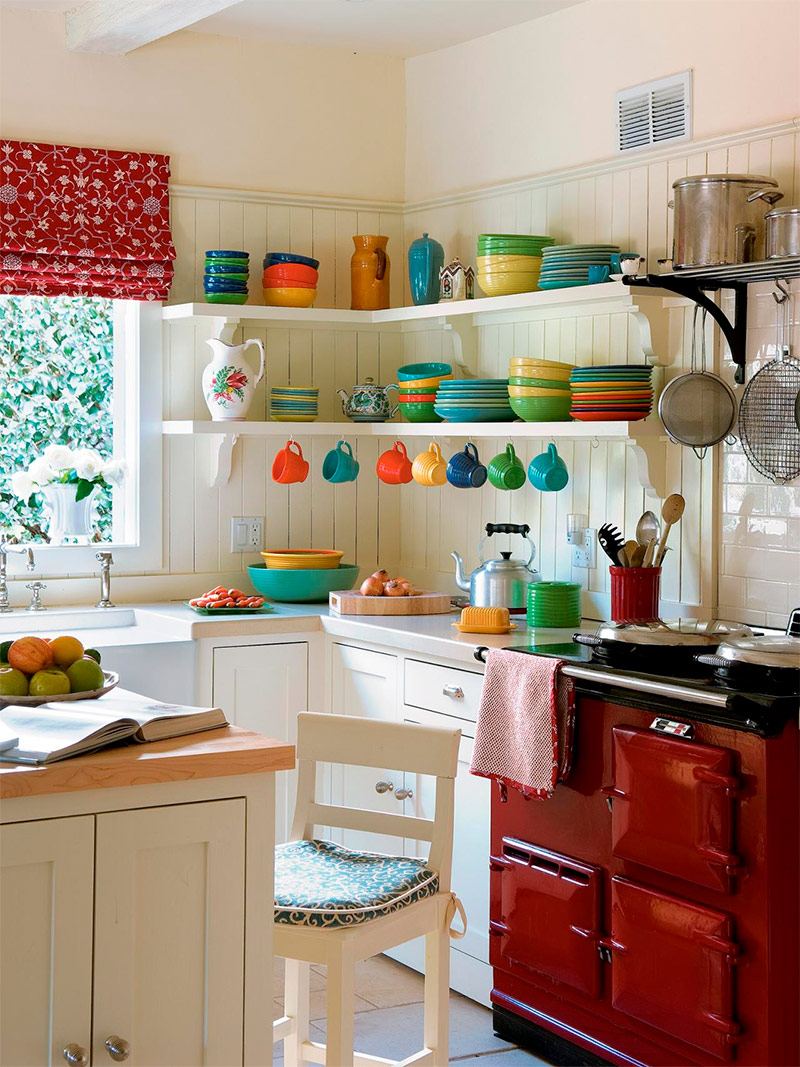
Although some may decide that having such a retro oven would go against their grandiose design plans, the owner of this kitchen used it as an inspiration for interior design in the classic style of a country house. The soft cream tones of the walls and cupboards are the perfect backdrop for multi-colored mugs, plates and bowls that perform both practical and decorative functions. The end result is a cozy and welcoming kitchen.
Experiment with unexpected colors - colors
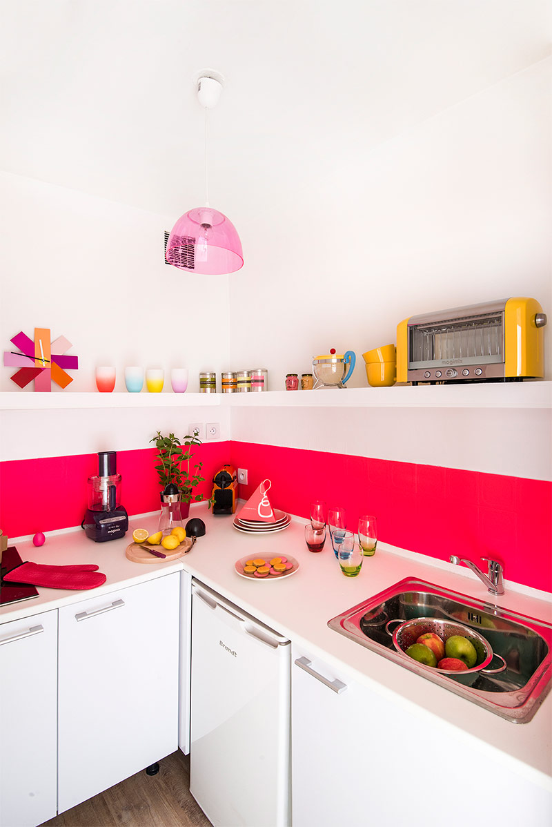
When choosing a color for a small kitchen, the average person is unlikely to name pink in the first place. Indeed, the kitchen, painted pink from floor to ceiling, will give rise to unsuccessful associations with the bedroom of a teenage girl. However, having applied only one strip of pink on a snow-white wall, the owner of this kitchen created a cheerful space that does not cause esthetic rejection among representatives of both sexes and all ages. All kinds of colorful baubles, candles and decor items helped to strengthen the created colorful mood.
Stylish but attractive - color
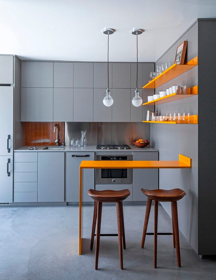
Walls and cabinets painted gray from the floor to the ceiling are not often found in the kitchen, and yet in this interior gray looks quite appropriate. Of course, the gray polished cement floor and the same color cabinets and walls themselves look harsh, cold and unattractive, but the owner of this kitchen managed to bring liveliness to the space with the help of bright yellow shelves and a bar counter. A lacquered wood kitchen apron adds texture to this elegant interior. Although for many such a design decision may seem too bold, there are those who like it - these are people who want something sharp, urban and modern.
Stunning simplicity - color
If you have a small kitchen, this does not mean that you should compensate for this by using attention-grabbing colors and filling the space with many decorative trinkets. The owner of this house decided to keep a sense of simplicity in his kitchen by combining white cabinets with dark gray walls. This room is not crowded with decorative elements, but small accents are still present. All of them - and a miniature tree on the kitchen table, and photographs in frames on the next wall - give the space life. This example once again confirms that not all interior design options for a small kitchen should be excessive or vibrant.
White color makes the space bright - color
Many people are afraid to use a white palette in their homes. They fear that the interior will look too fresh, and the premises seem underdeveloped. However, if you look at this magnificent kitchen, you can make sure that the white color scheme can make the space bright, welcoming and very sophisticated. White walls and white furniture in this small kitchen blend perfectly with natural wood floors.
The bold use of black is color
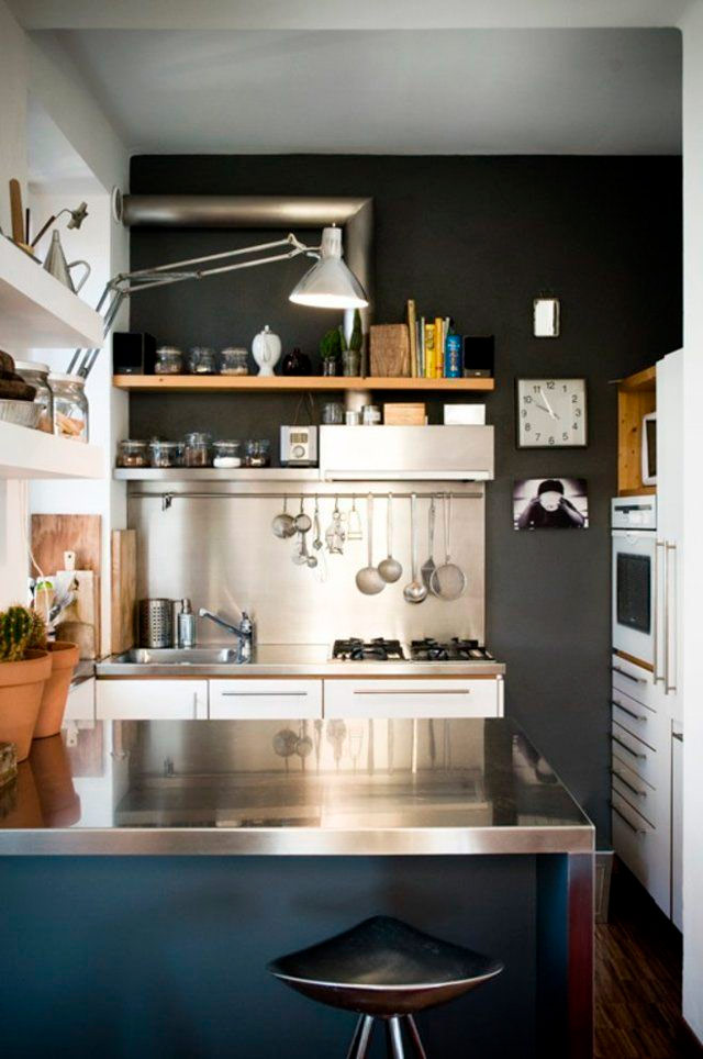
For many people, the idea of painting even one wall in the kitchen black seems terrifying. For most of us, black walls are associated with dreary basements or moody teenage rooms. Nevertheless, thanks to the rather bold use of the black accent wall, this kitchen looks quite elegant and modern. Polished metal countertops and a kitchen apron helped to avoid a dull look. Light colors of drawers, shelves and cabinets give the space some brightness. This example is a demonstration that bold design decisions in the long run are sure to pay off.
Graceful colors and geometric print - color
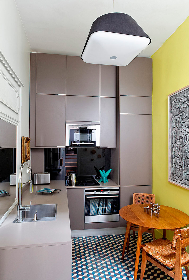
If you prefer your kitchen to look not so much cozy as it is modern, then this design scheme is ideal for you. The owner of this house chose a gray-yellow color scheme for his kitchen, which gives the space a somewhat futuristic look. This feeling is enhanced by the geometric print used both in the picture on the wall and in the rug on the floor. The unique pendant lamp, as well as the entire room as a whole, seems to have come from the pages of a science fiction book. This design option is ideal for those who prefer a modern classic to a cozy classic kitchen.
Bright, blue, flickering - color
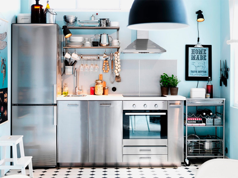
Blue color - calm and relaxing - a great choice for the kitchen. Many of the kitchen design examples that you met today use a variety of shades of blue to give the space an element of tranquility. The owner of this kitchen has connected the light blue walls with the polished silver surfaces of the cabinets and kitchen appliances to create an incredibly calm and welcoming atmosphere. Small accents, such as the image of a dragonfly and various decor items, strategically placed throughout the space of the kitchen, create an atmosphere of home comfort and hospitality. Take an example from the person who designed this room and select artwork in the same color scheme as the space as a whole to create a complete look for the interior.
White cabinets blend perfectly with natural wood - color
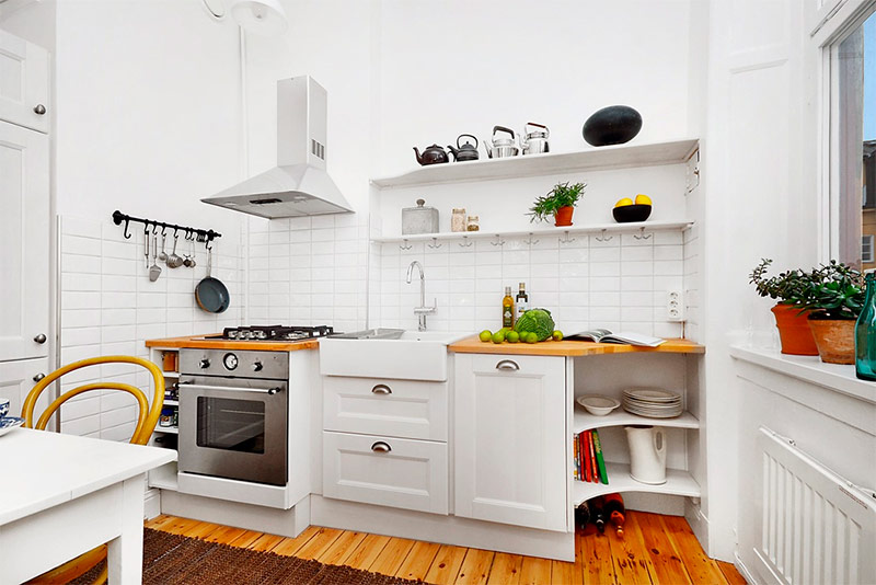
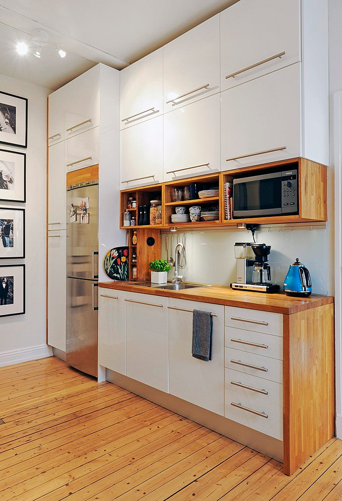
This homeowner, despite the fact that he was forced to work with a very limited space, turned his modest kitchen into a serene place of seclusion from everyday fuss. To create a concise finished look, he combined simple white cabinets with countertops and shelves made of wood. As a result, the interior turned out magnificent and incredibly functional. Recessed luminaires generate an ideal amount of light for work and leisure. The combination of artificial and natural materials makes the interior look modern and classic at the same time.
An unexpected combination of lilac and black - color
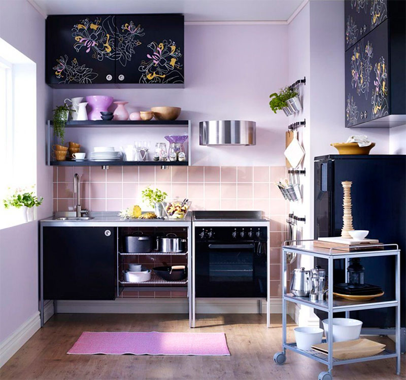
Sometimes the best strategy for decorating the interior is a combination of seemingly incongruous colors. The owner of this house got a kitchen with lilac walls and dark cream apron tiles. The expected choice would be to place here silver or white cabinets and household appliances. He went the other way - introduced black into the interior. As a result, the kitchen has acquired a soft and feminine, but, nevertheless, very modern look. This kitchen is amazing when filled with natural sunlight, so the heavy curtains on the window here would be completely redundant.The mobile trolley is ideal for a small kitchen - you can press it against the wall or roll it to the center of the room as needed.
Introducing color into a tiny white space - color
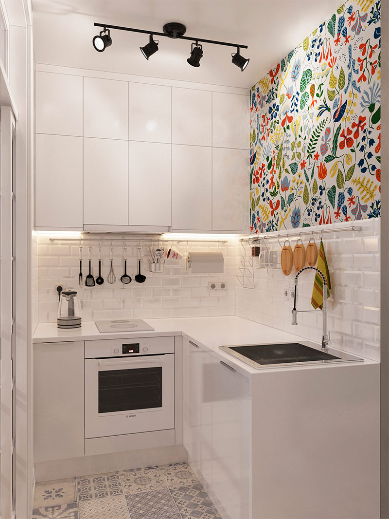
This small kitchen corner would be too boring and tasteless, if not for the creative work of its designer. Having pasted a small section of the wall with wallpaper with a bright multi-color print, he was able to give some amazing personality to this tiny space. The rug also has an interesting pattern, but already in black and white colors, so as not to distract attention from the accent wall. The illumination of the lower part of the hanging cabinet, however, like the ceiling lights create an amazing glow in this predominantly white space. Hanging on the railing all kinds of kitchen utensils, on the one hand, is quite functional, on the other - it is part of the decor.
Turning Cold Gray Into Something Cozy and Warm - Color
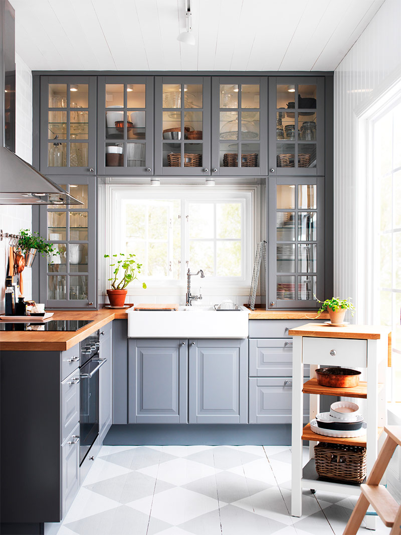
Gray can be a complex color for designers. If everything is done correctly, he is able to give the interior a very stylish and modern look. However, otherwise, i.e. when the designer made a mistake, the room will seem cold and uncomfortable. The owner of this kitchen was clearly striving to decorate the interior in the style of a country house, and the dark gray cabinets in this case can hardly be considered an obvious choice. Nevertheless, thanks to the illumination of the cabinets and the abundance of natural sunlight, this kitchen has become bright, spacious and comfortable. Gray actually adds a little color and personality to an interior that would otherwise be too simple and straightforward.
Black and white - color
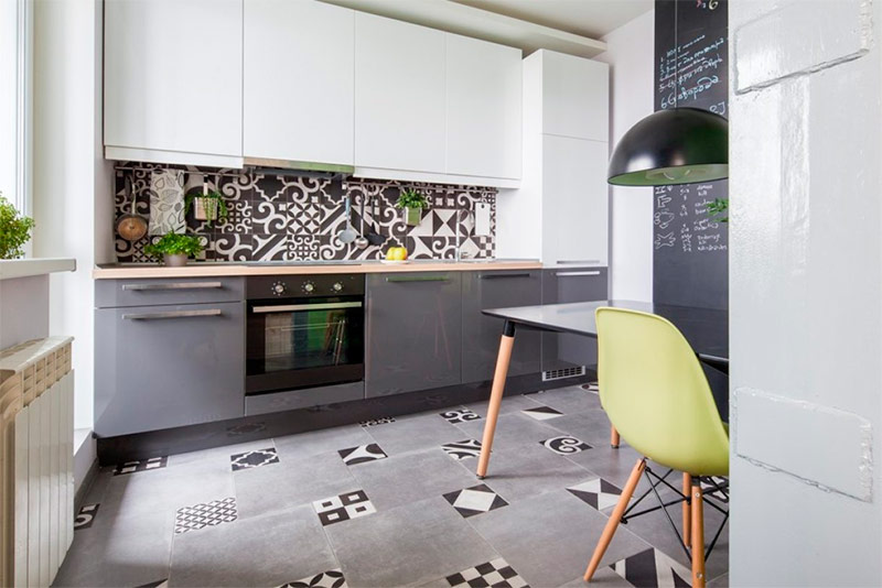
The black and white color scheme may seem like an unexpected choice for the kitchen, but it’s really nice to work with it. The designer of this interior chose white for the upper cabinets and dark gray for the lower cabinets. The kitchen apron has a spectacular black and white pattern that is striking. Many modern black and white interiors tend to use small colorful accents designed to compensate for the simplicity of the design. In this case, the light yellow chairs next to the dining table contrast with black, white and gray.
The boldest blue kitchen apron - color
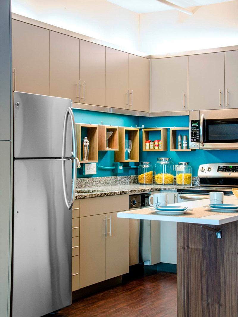
The design of this kitchen cost its owner, probably not too expensive, but completely transformed the boring interior. The apron of incredibly bold blue colors helped bring life to the initially rather simple kitchen. Just by changing the color of the kitchen apron, you really can completely change the appearance of the space without making expensive and time-consuming repairs. It is also an excellent choice for tenants, as you can do this quite quickly, even before entering a rented apartment. Let us draw your attention to the open drawers used here: they are not only functional, but also have a decorative function - they allow you to turn kitchenware into attractive jewelry.
Abundance of colors and shapes - color
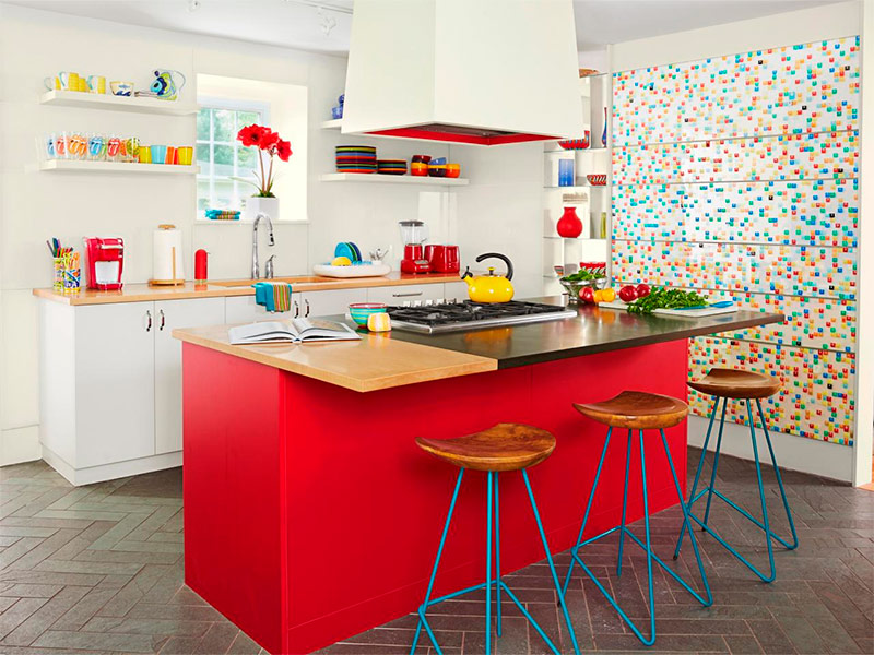
Working with a wide range of colors helps revitalize any room. The designer of this interior painted the base of the central island table in red to create a magnificent focal point in this kitchen. The wall, painted from floor to ceiling in many colors, also adds a lot of space and joy to the space. Thanks to such a multicolor of one of the elements, a great freedom appeared in the choice of decorations for shelves and countertops. Take an example from this homeowner and keep white or any other neutral color of the walls, if you plan to decorate the interior with many bright colors and textures.
Using accents
Modern, sunny and bright - light or accents
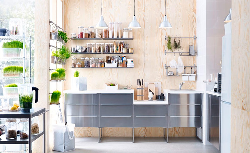
In recent years, homeowners are increasingly abandoning cozy shabby chic in favor of a modern minimalist look.This kitchen is full of sunshine and attractive comfort, but at the same time it looks modern and very sophisticated. The matte metal surface of the cabinets gives the kitchen a stylish look, and the abundance of greenery and huge floor-to-ceiling windows ensure that the space will appear bright and attractive. Please note that the decorative jars with spices in this kitchen are stored on open shelves, and not hidden somewhere deep in the cabinets - a similar design move can be reproduced by anyone.
Soft, feminine and sunny - accents
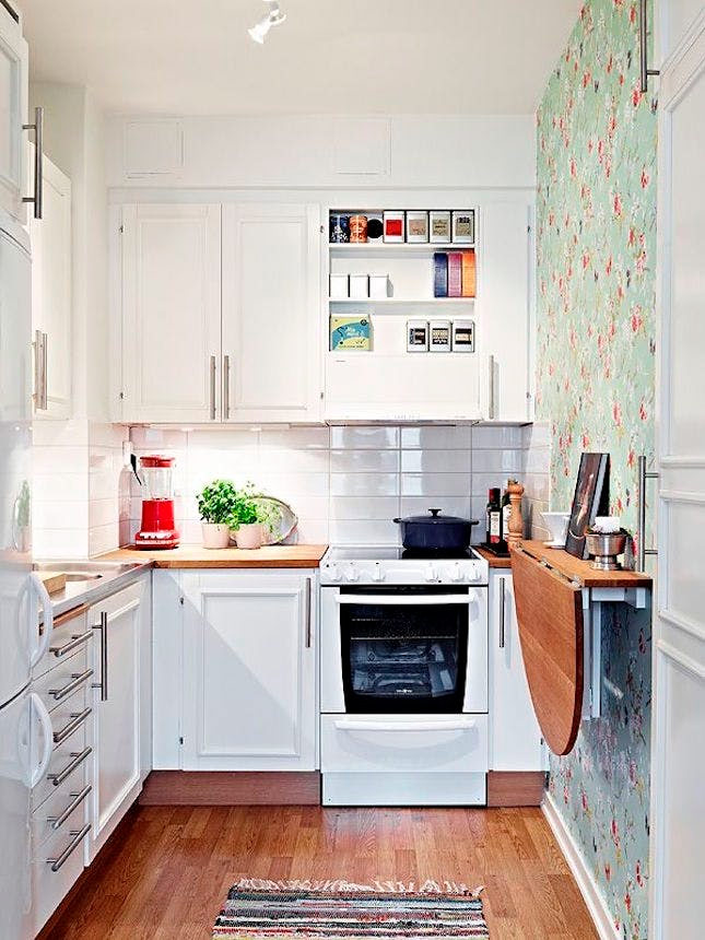
To create an attractive interior, modern architecture and fashionable design accents are completely optional. There is nothing wrong with sticking to a classic, feminine design scheme. The owner of this kitchen has emphasized the wall, decorated with cute green floral wallpaper. It goes well with the rest of the space - simple but bright white. A folding table on the wall is a great idea for those who simply do not have enough space to place a regular dining table in the kitchen. Stools can be stored in a nearby pantry and removed as needed. This is a great example of using a small space without overfilling it with furniture.
Cherry red fridge as a center for kitchen interiors - accents
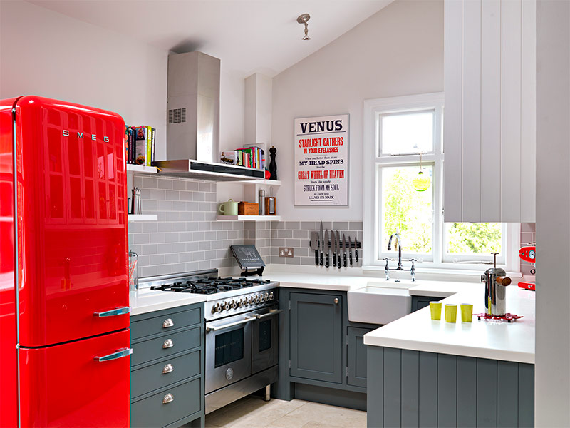
Having familiarized yourself with a fairly large number of examples of kitchen design, you will probably notice that in most cases one element is selected that will serve as the focal point of the space. In some cases, this is an accent wall, in others - an island kitchen table. In this unique kitchen, a cherry-red refrigerator acts as such a coordinator. The creator of this interior was smart enough to keep the muted shades in the rest of the kitchen - the dark gray cabinets are not able to compete with a bright refrigerator. The red text on the poster next to the window serves as a wonderful accent that ties the whole decor scheme together.
Brick wall - accent
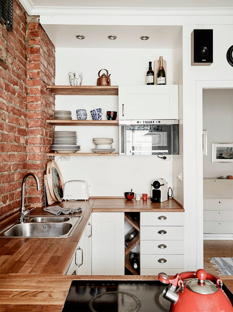
In many of the kitchen design examples we saw, the wall is accentuated intentionally. However, in some houses and apartments, such a wall exists initially - a brick wall, not covered with a thick layer of plaster and other finishing materials. Instead of hiding the brick, you can try to work with what is. The white colors of the room and the natural wood worktops in this kitchen perfectly complement the rustic rustic look of uncovered brick. Built-in shelves allow a wonderful collection of teapots and accessories to be in a prominent place.
A cabinet with lighting becomes the focal point of the kitchen - accents
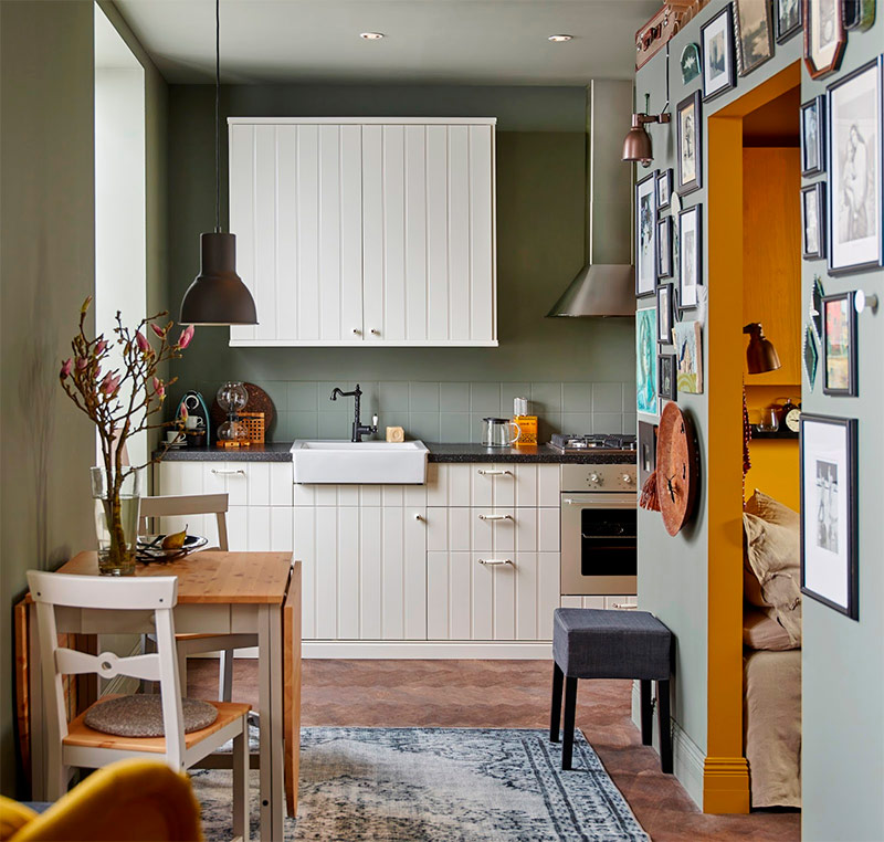
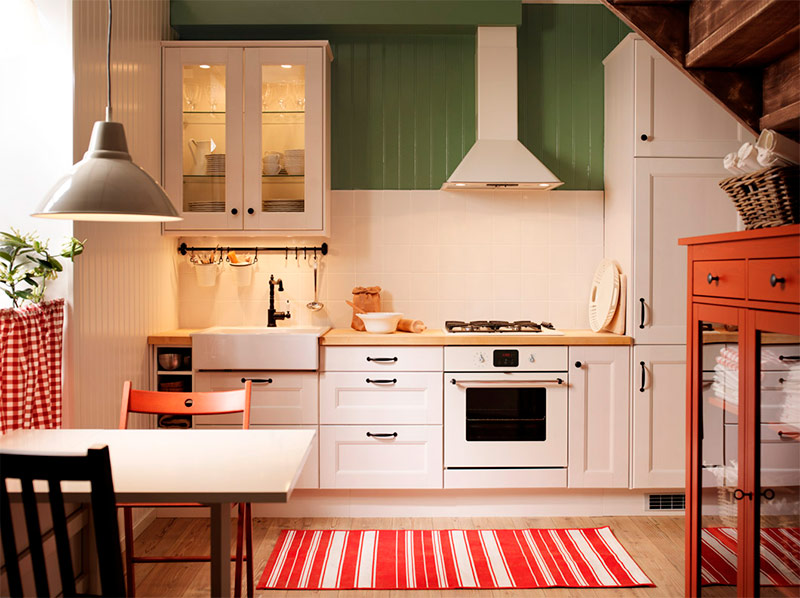
As we already said, in many really magnificent kitchen interiors there is an object that is sure to catch your eye. In this example, this is a backlit cabinet located above the sink. This is the perfect way to showcase your china, beautiful dishes, or tea sets. Such cabinets will look harmonious in almost any kitchen. For example, here the closet fits perfectly into the modern interior with a touch of country style. The contrast of the olive-green walls and the light ivory kitchen apron creates a very chic look, and the checkered curtain makes the atmosphere of the room even more cozy.
Unique shapes and patterns give the small kitchen a new life - accents
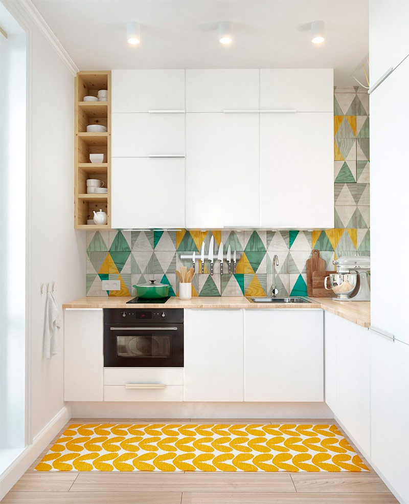
To work with unique shapes and patterns, a special courage is required from the designer. Multi-colored triangles on the walls of this kitchen could easily “oversaturated” the interior. However, preserving the simple appearance of the cabinets and countertops, the owner of the house created a bright and modern, but not overwhelming design. The carpet, which has a similar, but still not matching pattern, perfectly complements the wallpaper.I must say that such wallpapers for many may seem intimidating, but if done correctly, the end result will be truly stunning.
Aztec Charm Atmosphere - Accents
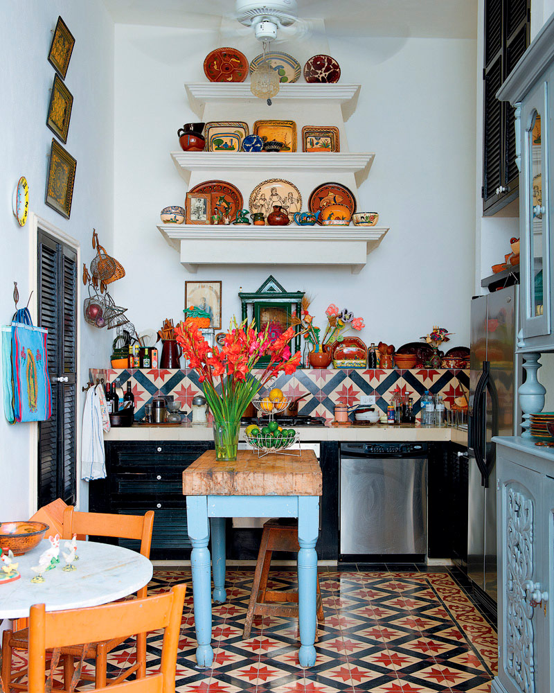
The owner of this kitchen must have been inspired by the magnificent old buildings of Mexico City. As a result, the interior turned out to be bright and cheerful. The pale blue table legs and cupboard are surprisingly complemented by the bright pink, red and orange tiles of the kitchen apron and various decorative elements. The used decoration technique creates the illusion of increasing space. A pyramid rack full of beautiful antique features instantly makes this kitchen twice as large as it really is.
Say everything you want with wall art objects - accents
An art object can “make” or “break” a space, and kitchens are no exception to this rule. The design of this kitchen can be called relatively simple. Nevertheless, there is an excellent focal point here - a large floor-to-ceiling art object with text. There is not so much free space in the kitchen, but still managed to find strategic places to place the decor. Take a look at this kitchen, and you will understand that you can bring life to any space, regardless of its size. It’s only necessary for you to be creative enough.
Eclectic Design - Accents
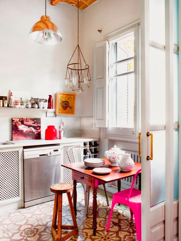
An erratic “dumping” of various decor items can be very dangerous. Although the finished product may turn out to be eclectic, which you apparently wanted, you run the risk of getting bad taste. The owner of this kitchen managed to achieve a harmonious look. Two pendant lights are completely different, but not bad combined with each other. Around the dining table gathered two completely different chairs and a stool, but this whole motley "company" looks pretty harmonious. If you're a fan of eclecticism, get inspired by this fancy design.
Futuristic modernity - emphasis
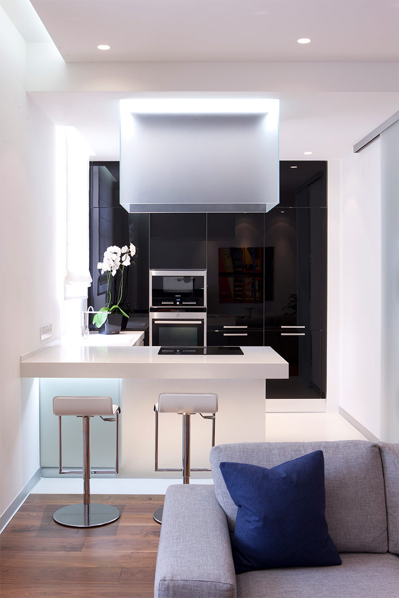
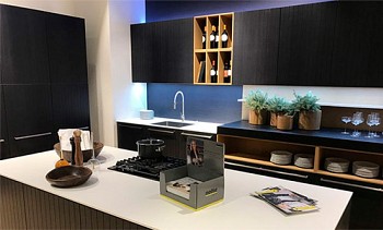
No one will ever blame the designers of this interior design that the kitchen they created turned out to be rustic and too homey. This stunning contemporary design is bold, gorgeous and utterly futuristic. The shiny black cabinets serve as a kind of accent wall, contrasting beautifully with the dazzling white surroundings. The focal point of the space, without a doubt, is a lamp with frosted glass, also made in a futuristic style. Highlighting the bar creates a chic glow of the entire space. The owner of this kitchen acted very wisely: he did not place any works of art or decor items here, allowing instead to receive aesthetic pleasure from architecture and design that speak for themselves.
Refined, soft and comfortable - light
In our selection, this is perhaps one of the most pleasing to the eye examples of interior design of a small kitchen. Although the kitchen itself is really small, the abundance of natural light and many shades of natural wood give it an open and attractive look. The soft cream color of the built-in wardrobes and shelves blends perfectly with the impeccably white walls. Metal countertops help to expand the space even more, because the sunlight pouring from the window is perfectly reflected from their mirror surfaces. Although this design seems simple enough, it looks amazing.
Furniture and storage
Kitchen hidden in furniture - furniture
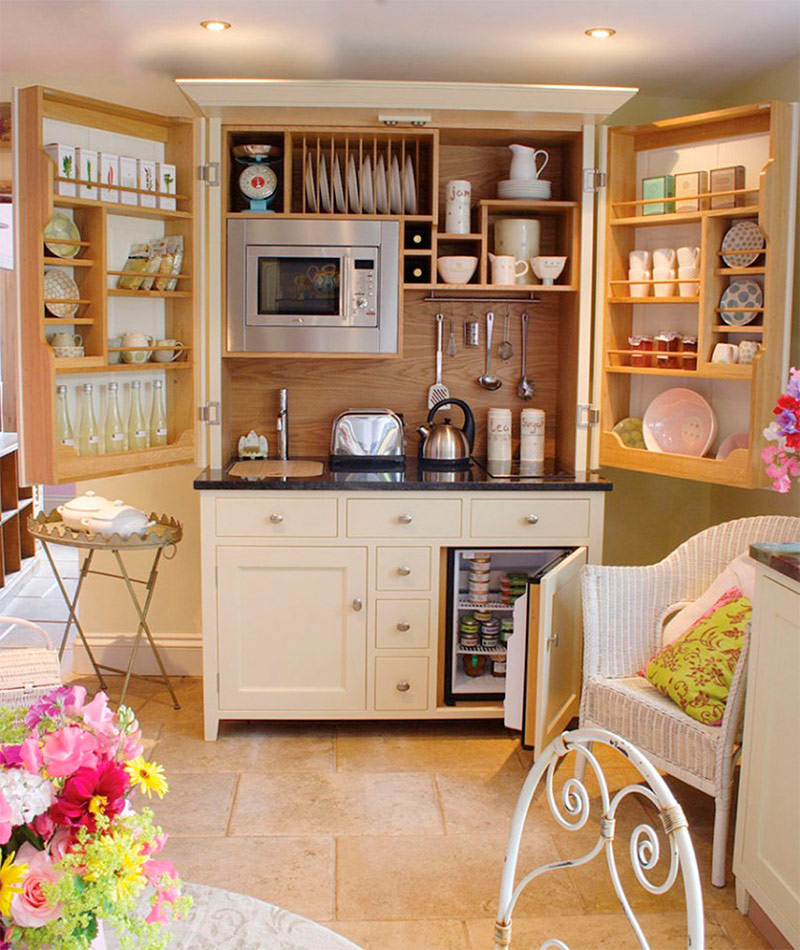
It is unlikely that anyone was able to arrange a tiny space better than the owner of this kitchenette. It occurred to him to place a whole kitchen counter, including a sink, microwave and many shelves, in a large, floor-to-ceiling cabinet. It should be noted that the cabinet looks beautiful both open and closed.This kitchen corner is fully functional and fits well into the interior of the rest of the house, decorated in the style of shabby chic. For a kitchen with very limited space, such a design solution can be considered ideal, especially if the living room has a functioning bar counter.
Who needs cabinets when there are shelves? - furniture
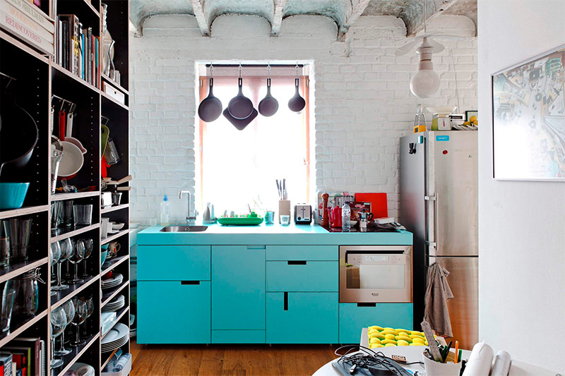
Some designers fighting for clean style will indignantly gasp and gasp at the thought of using bookshelves in the kitchen instead of cupboards, but those who like the modern style of interiors will immediately recognize this bold design step. For many residents of urban apartments, bookshelves may be the only available place to store plates, dishes, and kitchen utensils. The use of shelves can be considered one of the most reasonable solutions both in a limited space and with a limited budget, the main thing is that the end result is attractive.
So tiny ... it's so simple - furniture
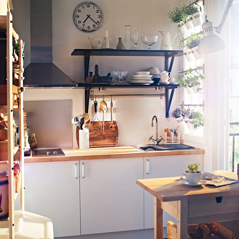
If you are looking for ideas for the budget design of a small kitchen, you can stop your search. Consider that you have already found what you need - take a look at this amazing tiny space. Although its owner did not replace the existing furniture and fixtures, he managed to breathe life into this small kitchen. But he simply set two elegant black shelves above the countertop and placed them on a delicious tableware. In addition, the homeowner knew that living plants would help to decorate the space, so he hung small pots of indoor flowers on the silver roof rails located by the sunny window. Bringing these little design ideas to life is not worth a fortune, but can completely modify any space.
Cheeky sophistication with a special charm - furniture
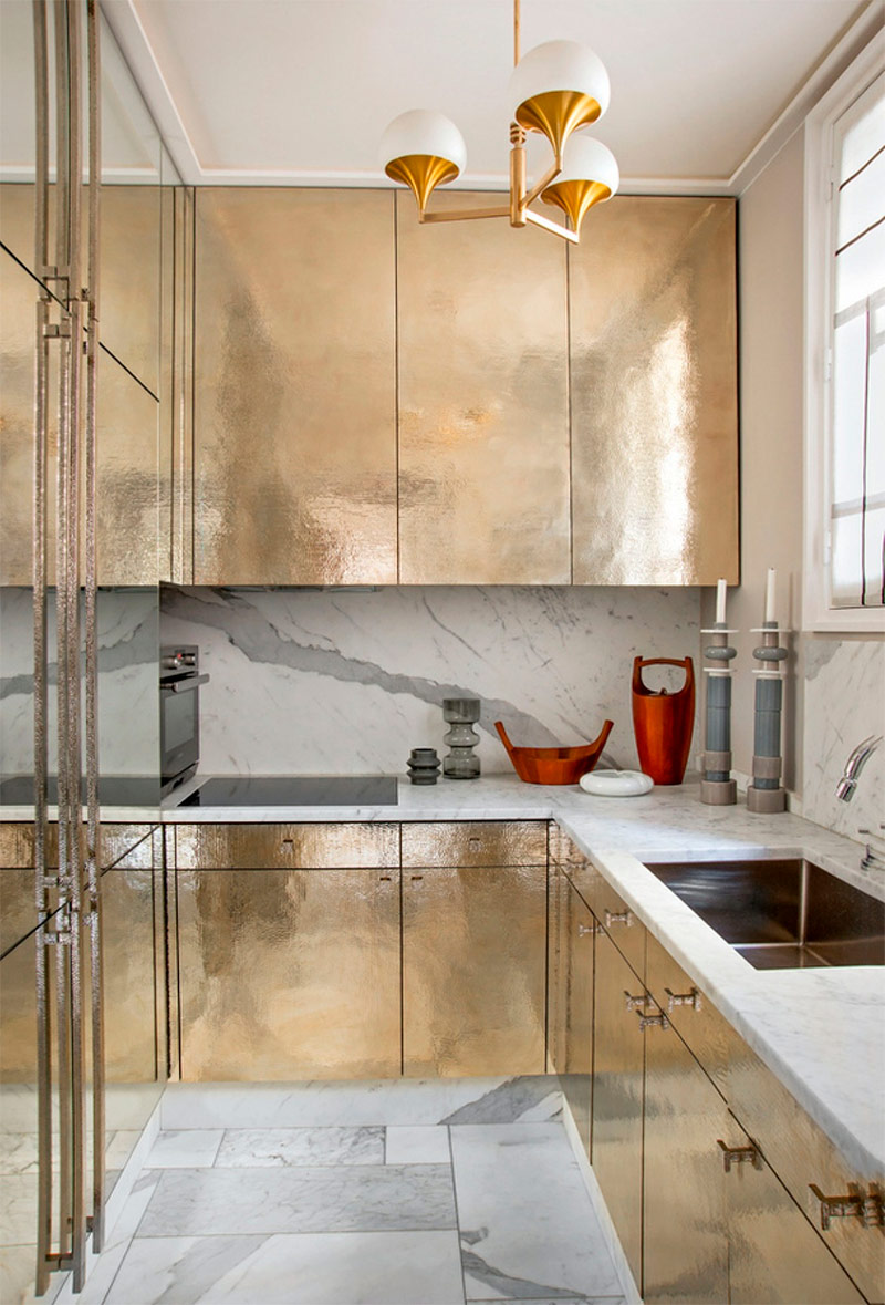
The homeowner's decision to work with such sophisticated materials has made this small kitchen look like a million dollars. Gold cabinets create an atmosphere of sophistication, and their reflective surfaces give the illusion of an increase in space. The marble pattern on the kitchen apron also adds sophistication to the interior of this small but stunning kitchen. When you are looking for interior design ideas for a small kitchen, don’t feel that limited space is holding back your choice.
Dark, elegant and mysterious - furniture
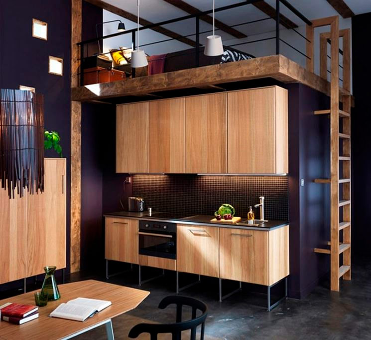
When you get acquainted with various ideas for designing a kitchen of a small area, you are unlikely to find many "mysterious" options. It is this word that is best used to describe the innovative design of the kitchen presented in this example. This small kitchenette is part of the open-plan attic space, which for most of us to form an idea of design is an overwhelming task. However, the designers of this interior, thanks to the use of light wood for the manufacture of cabinets, managed to create a zone that stands out without conflict with the rest of the very dark attic space. This magnificent kitchen creates an element of softness in a very dramatic space.
When there is not enough storage space, look up - furniture
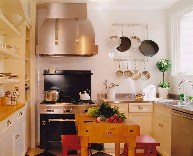
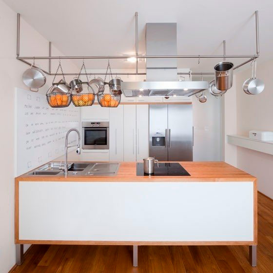
In professional kitchens, under-ceiling storage is a necessity and even the norm. This homeowner has taken the lead of professionals and installed several simple hanging rods in his kitchen that can be used to store everything you need. Hanging baskets serve as an excellent and functional place to store fruit; it is also easy to hang pots and pans here. Such a simple fixture is ideal for those who work in confined kitchen spaces. It is not only incredibly convenient, but also allows you to give the kitchen a complete modern look with minimal effort.
Chef's Dream - Furniture
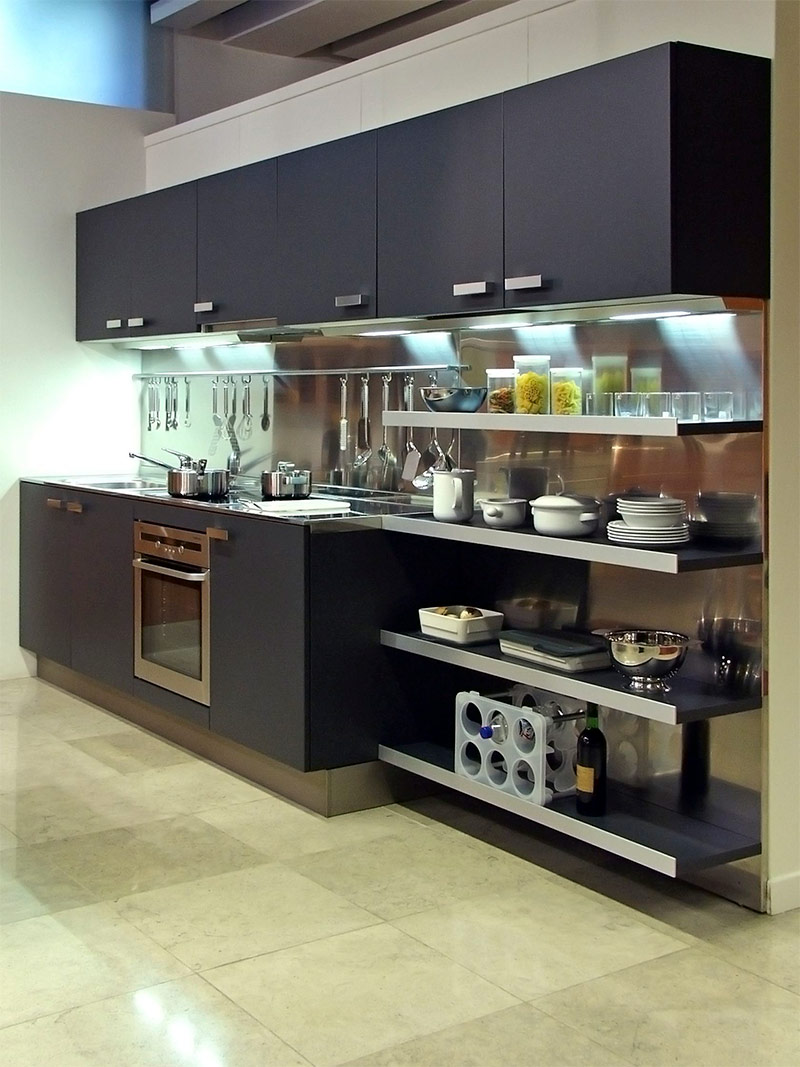
Even if you cook a lot and “fly” around the kitchen like a bird, don’t feel limited by a small space.By installing an open rack and railing for hanging dishes, the owner of this kitchen can store a lot of everything you need in a relatively small area. If things are kept neat and organized, space never seems cluttered. The dark gray, almost black cabinet goes well with silver countertops and a kitchen apron. These truly impressive cuisines can be seen in upscale restaurants. In such a functional kitchen, professional and novice chefs will feel at home.
Dressing
Work with what you have - decor
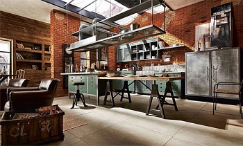
The original look of this kitchen for many might seem like a nightmare. For the first time stepping over the threshold of this room, the residents of the house found uncovered exhaust ventilation and shelves instead of cabinets. They did not start a major renovation in an attempt to hide these shortcomings, but used them in the design of their tiny kitchen. Shelves were decorated with dishes, books and various trinkets to give the space some personality. Instead of trying to “hide” the ventilation pipe, elegant lamps were hung on it. As a result of these simple transformations, the kitchen has acquired an incredibly modern urban look.
Simple and rational - decor
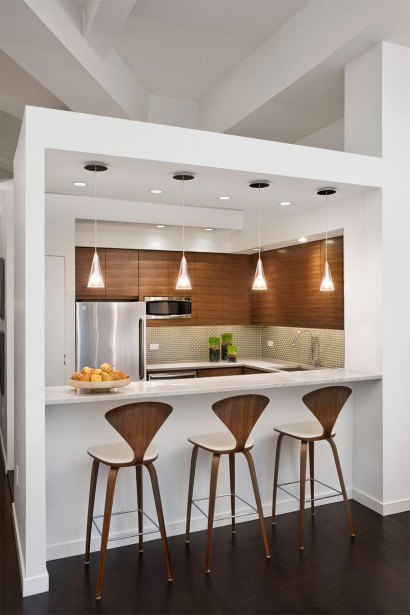
Your tiny kitchen doesn't have to have an accent wall or a bright design. Take an example from this homeowner and keep your kitchen simple and orderly. The space is small, but the combination of white walls and painted wooden cabinets creates a feeling of brightness and openness. Gorgeous lights above the bar serve as an ideal space coordinator. The owner of this kitchen did not use countless decor items here, diversifying the simple interior with only three green plants and a fruit bowl.
Meeting of the West with the East - decor
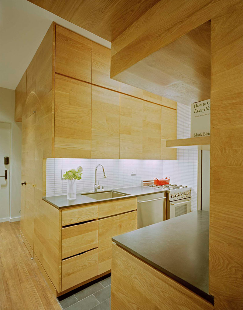
The creators of this beautiful kitchen corner drew inspiration in the calm style of Japanese architecture. The atmosphere of this space evokes memories of the beautiful interiors that can be seen in modern boutique hotels in Tokyo. Wooden cabinets, floors and walls give rise to a sense of calm and serenity. The backlight built into the cabinets creates a light, almost unearthly glow. If you want to recreate this Zen atmosphere, take an example from the owner of this house and keep the amount of decor used to a minimum. A simple vase of flowers is really all that is needed in this interior, and this is quite enough not to spoil the created sense of calm.
Design and Space Ideas
Futuristic Design - Space Organization
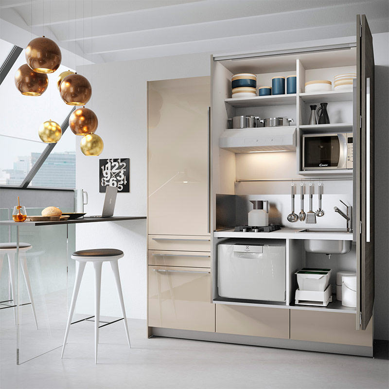
If you prefer a modern futuristic style to a classic modest home environment, then this kitchen design scheme is ideal for you. This kitchen uses hidden space - a similar solution is very popular in major Asian cities such as Seoul or Tokyo, where the area of apartments is very limited. Everything in this interior looks modern - from polished metal surfaces to hanging golden spherical lamps. This design idea is suitable for any resident of his own or rented apartment who wants to turn a small kitchen space into something more.
A small space in the style of the fifties - the use of various styles
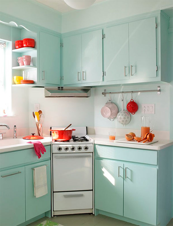
The creators of this tiny kitchen drew inspiration from the classic interiors of the 1950s. The cabinets are painted in a light emerald color that was widespread then, instead of a large modern stove, there is a tiny gas oven of a rather old model, kitchen utensils and Tupperware utensils from the middle of the last century are used to decorate the space. Obviously, the owner of this kitchen tried to give it a retro look! For some, such a retro interior may seem quite bold, but the classic style of the 1950s kitchens is a piece of America that will be popular for a long time to come.
Cubist-style kitchenette - space organization
This small kitchen is a vivid example of how the choice of interior decoration method depends on the existing architecture. Perhaps many would be confused, deciding what to do with this small cubist kitchen corner, but the owner of this house found a solution and at the same time managed to make the interior light, airy and neutral in terms of the color used. The unique architecture as a result does not look too modern or futuristic. Small accent touches like books, artwork and vintage spice jars give this kitchen a beautiful, welcoming feel.
Taste of country
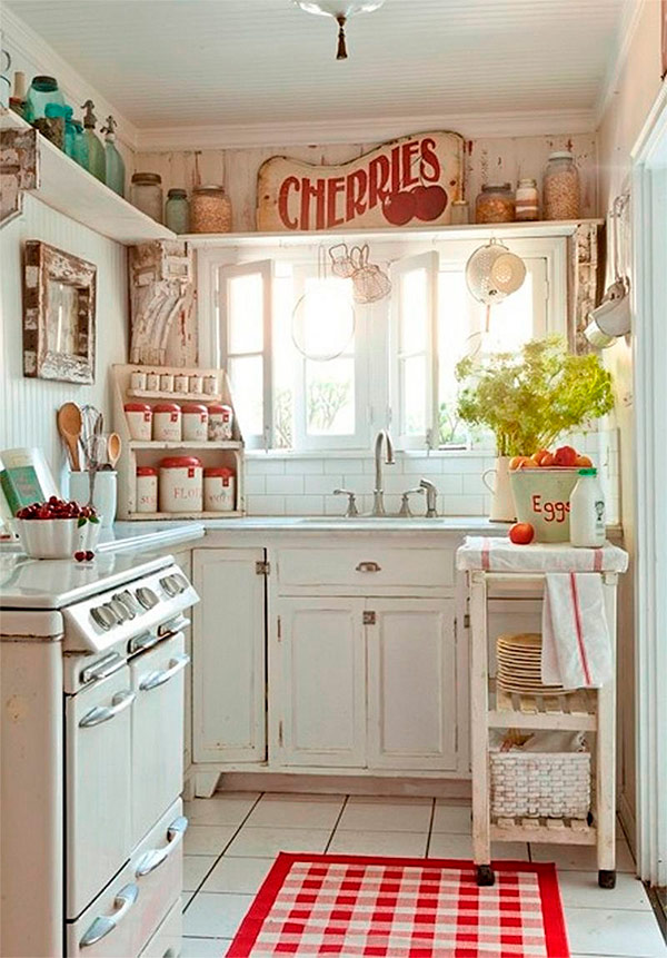
While modern and stylish design tends to dominate among the most popular, we all at least sometimes somewhere deep down want something cozy. In this tiny kitchen, the original furniture and a retro-stove - the designer is clearly gravitating towards country style. The space is decorated with simple trinkets and a classic rug in red and white cage. As a result, the kitchen has acquired a soft, comfortable and feminine look. The modern design certainly looks exciting, but these simple, classic rustic-style kitchens still grab our attention.
Simple design with full functionality - space organization
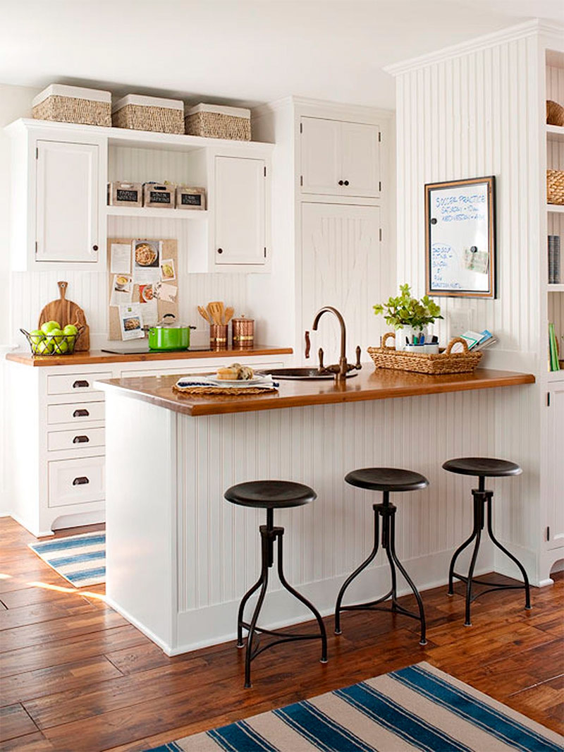
This kitchen is clearly intended for a very busy family. Everything here is aimed at quickly and effectively meeting the needs of the residents of the house (which is just a board hanging on the wall for important information and notes to each other). However, this functionality was achieved without sacrificing style. Walls and cabinets have retained a simple white color, but small accents such as striped blue rugs bring a little color to the interior. Take inspiration from this design (you can borrow the idea of using a marker board to place on it a list of products that you need to buy, or some kind of reminder to your household).
Combining multiple elements to create a unique design
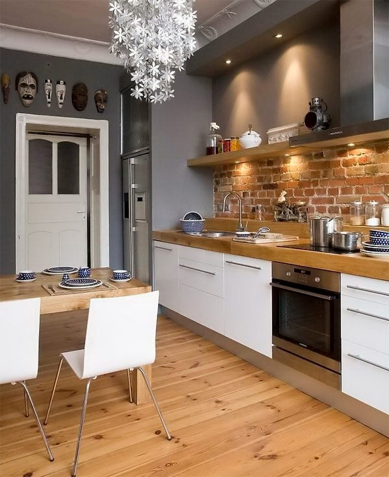
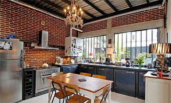
In this kitchen you can find the embodiment of several design ideas, which we have already mentioned above. From natural wood floors and open brick walls to creative accents such as tribal masks above the door, this kitchen combines various elements without looking oversaturated. A chandelier made of pendants in the shape of snowflakes might seem tasteless, but in combination with dark gray walls, and wooden countertops and floors, it looks quite stylish. This example demonstrates that with the right selection of colors and design elements, you can really do anything.
A lot of glamor in a limited space - the organization of space
Designing a very small kitchen can be quite a challenge, but if done right, it will look great. Take a look at this incredibly narrow kitchen and agree that this architectural flaw is almost invisible. Cabinets with glass doors placed above the sink attract the eye to the upper part of the space, which makes the room seem larger than it actually is. Beautiful large, floor-to-ceiling, cabinets of light cream color create a calm atmosphere, not without elegance. Colorful accents on the countertop bring a little color to the interior, and the beautiful black and white tile on the floor gives it personality.
Chic corner kitchen - space organization
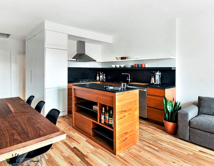
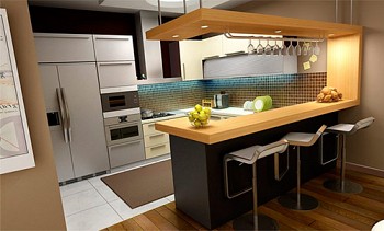
It is not easy to separate the kitchen area from the rest of the space in open-plan apartments. This corner kitchen could easily get lost in the interior. However, an elegant black apron and the same countertops visually separate the kitchen from the rest, a fairly neutral space. The wood from which the kitchen tables and cabinets are made has a darker shade than the floor, which also helps the kitchen stand out, perfectly harmonizing with the rest of the space.
Recommendations for planning a small kitchen
In conclusion, I would like to dwell on several important aspects that may affect your choice of the idea of designing a small kitchen in an apartment or private house.
Placement of kitchen equipment
Try to optimize the space available to you by focusing on issues of functionality.
Carefully consider your project and decide where to place large kitchen equipment (refrigerator, stove, etc.).
Get to know the working triangle rule. This concept has been around for over 70 years, but it is still widely used in the design world. This idea is quite simple, but it saves time and energy of a person engaged in cooking. The work triangle connects the three main work areas in the kitchen: sink, stove and refrigerator.

The distance between these points should be at least 1-1.5 m and no more than 2.5-2.7 m. The sum of all three sides of the triangle should be from 4 to 8 m. Considering how highly effective the result is, it is definitely worth taking this rule into account when considering various projects the kitchen.

Double row.

Peninsular.

Ostrava.
Think of an L-shaped or U-shaped furniture layout with a large island or peninsular table in the center. These forms provide many cabinets and countertops and easy access to them. You can attach a bar counter to the island table, where you can have a snack.

L-shaped.

U-shaped.
Storage space
When planning your space, don't forget about storage spaces. In the kitchen, as a rule, there are a lot of dishes, pots, pans and various kitchen utensils, and you need to have enough space to store all this within easy reach. Since horizontal spaces are limited in small kitchens, think about the vertical: install all kinds of racks, racks, and shelves that extend high along the walls. Try to find innovative containers and multifunctional storage spaces.


Decoration Materials
Since your kitchen cannot boast of a large area, let it benefit from the use of interesting materials for decoration. Granite and marble countertops are a more elegant option, although concrete, limestone and stainless steel are in fashion today. Frosted wardrobes are great for modern design, while cheaper painted ones are for country. If you decide not to use a lot of color in the design of your little kitchen, try making a bright mosaic apron or bright flooring. Remember that reflective materials, such as mirrors, can create the illusion of increasing space.
Remember that your kitchen should reflect your personality. Your ultimate goal should be to create not only functional, but also a beautiful space where it will be nice to eat and relax.
Turn a small kitchen into something more by implementing one of the projects presented here. When it comes to decorating the kitchen, many people perceive the small space at their disposal as a death sentence. However, as you can see, having familiarized yourself with the fifty interiors presented here, this is not at all the case.
A small kitchen does not mean that your design ideas cannot be big. Regardless of whether you prefer country style or you prefer something elegant, chic and modern, you can create the desired image in a small space. Let your personality and design taste manifest. Even a very small kitchen can be filled with life.

